

Physics Wallah Logo Design Analysis
In my 10-year tenure of handwriting analysis practice and logo designing, I have analyzed multiple brand logos of the world.
One week ago, one of my friends asked me- Nirav, what about the PW brand? Have you analyzed or gone into the depth of the PW Logo? I was introduced to PW as a Brand through Shraddha Sharma’s story interview with Alak Pandey.
Hence, I thought of analyzing India’s 101st Unicorn Physics Wallah, better known as PW amongst the education segment and which creates a huge impact/dent in the Education Industry. Before moving to PW Logo Analysis, let me introduce the best brand in the education industry.
What is PW or Physics Wallah Logo ?
Physics Wallah Private Limited, popularly referred to in the media as Physics Wallah or PW was established in 2016 as an official YouTube Channel by Alakh Pandey, an educationist in Allahabad, Uttar Pradesh.
Together with the Co-Founders, Prateek Maheshwari, and Alak Pandey, he created an application form specifically for students aspiring to take exams for the National Eligibility Cum Entrance test (NEET) and the Joint Entrance Examination (JEE) by 2020.
In January 2023, Physics Wallah application forms were downloaded over 10 million times. In the past, the company joined the unicorn club by acquiring 100 million dollars in capital.
Additionally, Physics Wallah launched courses for School Prep, JEE, NEET, GATE, SSC, UPSC, PSC, NDA, CA Foundation, CA Intermediate, CSIR NET, IIT JAM, MBA, NEET PG, and CUET.
Now let’s dive into a complete analysis of the PW Logo or Physics Wallah Logo
PW Logo shows multiple things about the mindset of the Co-Founders and its team. It is seen that the brand logo has a Circular shaped Logo that shows the flow of ideas and thoughts.
Circular Shape in Physics Wallah Logo: Since the PW logo/Physics Wallah Logo has a Circular structure, the company is receptive by nature, and understands the pulse of the market as in the requirements of the students.
We all know that the company PW (‘Physics Wallah’) has launched multiple courses related to NEET, NEFT, UPSC, and many other competitive examinations.
The Circular shape depicts the flow of different ideas and the flow of money energies in the organization.
We can see that there are 2 colors in the company logo – white and black representing yin and yang energy.
The circular-shaped PW also depicts the Co-Founder as a hard-working team as a circular shape is never ending, which means there are lots of activities going on inside the company PW.
This flexibility and openness to change gives an approach to innovation and creativity. These changes are adaptable by the nature of the team hence the team would still work under pressure.
The Circular shaped PW Logo ( Physics Wallah Logo ) shows they connect with the sentiments of people and adopt old or new cultures that retain their team and maintain a friendly environment.
PW is very much conscious of its brand image. They make fast and precise decisions on their management, board of directors and the Teachers/Mentors.
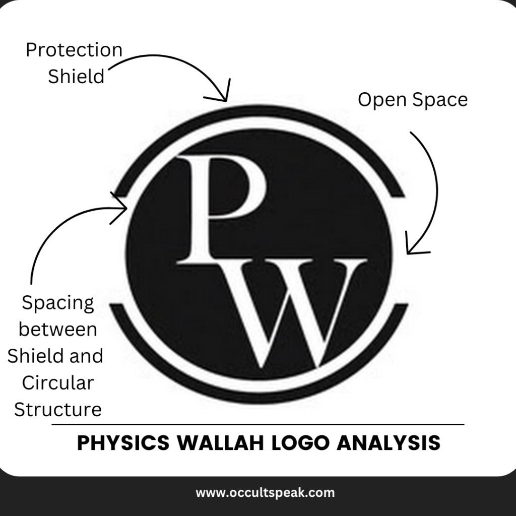
The Outer Shield in PW Logo/Physics Wallah Logo
The outer covering says it is a protective shield for the company as it works as limited access to the outsider.
We can say that the company is transparent but also very conscious of its brand image in the market when it comes to finance and management decisions, a few things may be hidden from the public domain.
Now look at the ring protection in the upper and lower part, indicating the core management and vendor supplier will not get much information about the plan for next quarter.
Again a disclaimer is that the company would reveal the information as target and vision for the next few years and monthly target.
But the left and right sides are open, which means that the launching of the products, pricing, and such strategies are revealed in advance in the public domain.
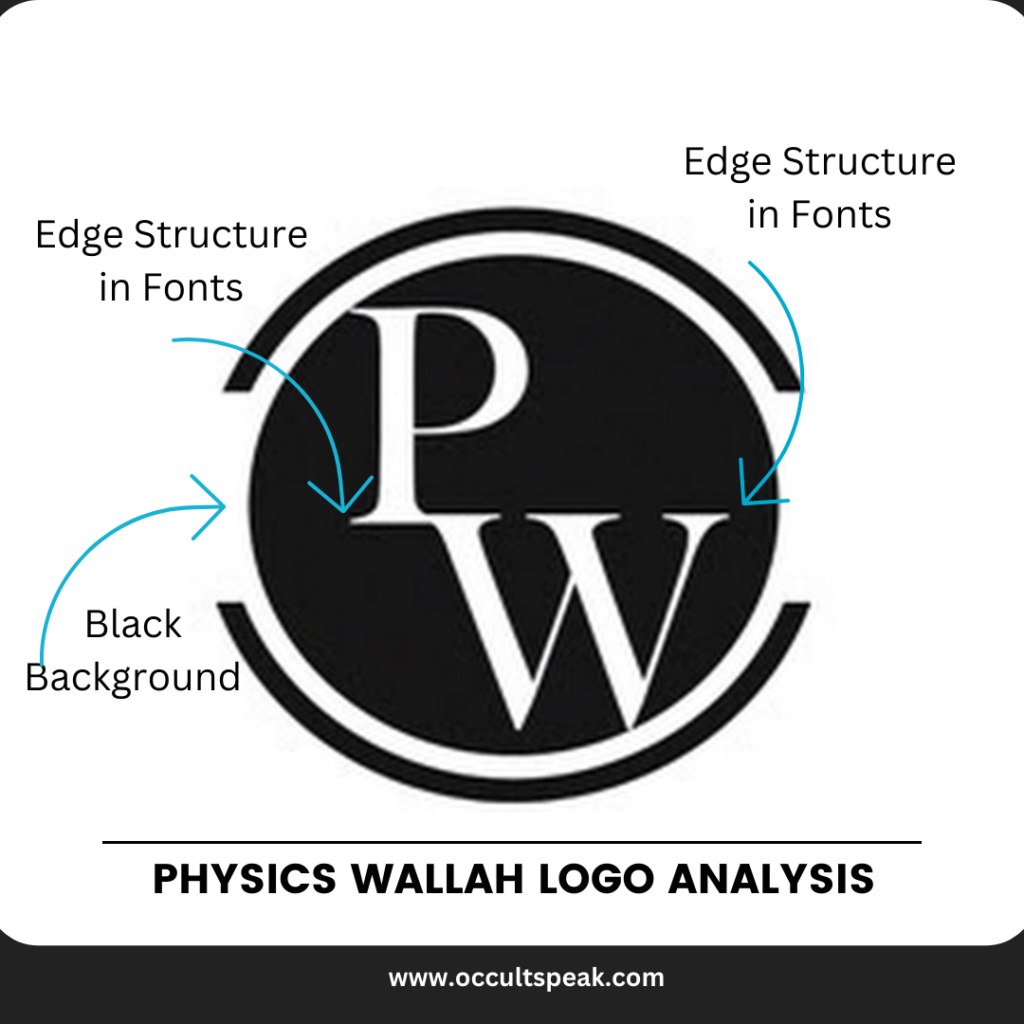
Letter in PW Logo ( Physics Wallah Logo ) Design
There are only 2 letters as a short version of Physics Wallah – this structure, also known as the Emblem Logo, shows the company’s belief in the old traditions and customs.
Again the company Physics Wallah used the Short form PW in the logo to show a good brand recall value, and these companies want more attention from the market, hence there can be a few controversies about the PW logo also.
The Font is well structured, and there is no squeeze or narrowing of the structure that shows that the company believes in work-life balance.
Just one part in the font that is not taken care of is that the Letter P touches the W letter at its base, known as a negative trait – this can lead to issues with time management and putting forward one opinion very firmly without any doubts – that is also a positive trait.
Color in the PW Logo/Physics Wallah Logo
There are only 2 colors in the Brand PW Logo Black and White Since White and Black in circular format reflect Yin and Yang energies that show an amazing planning and execution in the company Physics Wallah.
Black Colour in PW Logo/Physics Wallah Logo
It is a color of luxury, high lifestyle, and keen observation, hence the company would take care of the minute details before launching any products.
The color black also depicts other emotions like logic, elegance, luxury, and a judgemental mind.
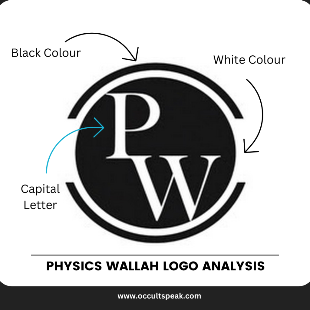
White Colour in PW Logo /Physics Wallah Logo
White is the color of binding, creativity, imagination, and innovation. Hence in this company, there would be new schemes and offers for the customers (students) and the teachers in the form of incentives.
There would be lots of planning and strategies going on in the mind of the co-founders and management also since the white color depicts vivid imagination, mind, and connectivity to mothers, and high creativity.
Teachers would be more connected to the students in the form of emotional bonding and understanding of the IQ of the students which bring a perfect product mix in the marketing.
This Brand Logo of PW brings harmony and win-to-win situations to the market as it shows a balanced logo.
However, I feel, a more aesthetic look could be given to the brand logo because the logo is the mindset of the founding team, it will resemble in form of shape and fonts.
I wish all the very best to the Team Physics Wallah for their future endeavors.
Love and Light
Logo Analyst
Leave a Reply