


The Election Commission of India Logo (ECI) is a pivotal constitutional body, established to ensure free and fair elections across the country. Headed by a Chief Election Commissioner and supported by two Election Commissioners, the ECI stands as a guardian of democratic processes in India.
Today, we delve into the intricate design of the Election Commission of India Logo, a masterpiece crafted by Shri Amitabh Pandey from Patna, Bihar.
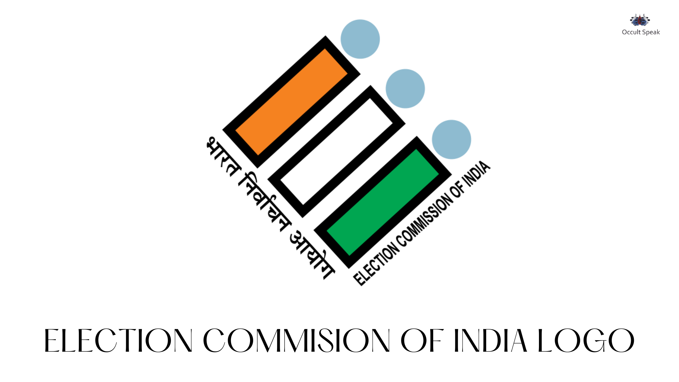
Symbolism and Design Elements in Election Commission of India Logo
The ECI logo-analysis is a dynamic emblem that transcends the barriers of caste, education, and economic status, embodying the spirit of India’s diverse electorate. Each element within the logo has been thoughtfully designed to convey a deeper meaning:
Enclosed Stable Form:
This shape symbolises the robust and foolproof nature of India’s democratic electoral process. It underscores the strength and stability of the system without explicitly focusing on its mechanisms.
Alphabetical Representation:
The logo subtly incorporates the visual forms of the letters ‘E’ and ‘I’, representing ‘Election’ or ‘Equality’ and ‘India’ respectively. This clever integration emphasises the core values of the Election Commission.
Tri-colour Stripes in Election Commission of India Logo:
The stripes in three colours mirror the Indian flag, fostering a sense of national pride and belonging. This tri-colour scheme reinforces the logo’s connection to India and its democratic ethos.
Electronic Voting Machine:
The composition of various marks within the logo evokes the image of an electronic voting machine, a crucial element in modern Indian elections. This visual cue links the logo directly to the technological advancements in the electoral process.
Let’s delve into the analysis of the Election Commission of India Logo, employing both Graphology and the fundamental principles of Logo Design.

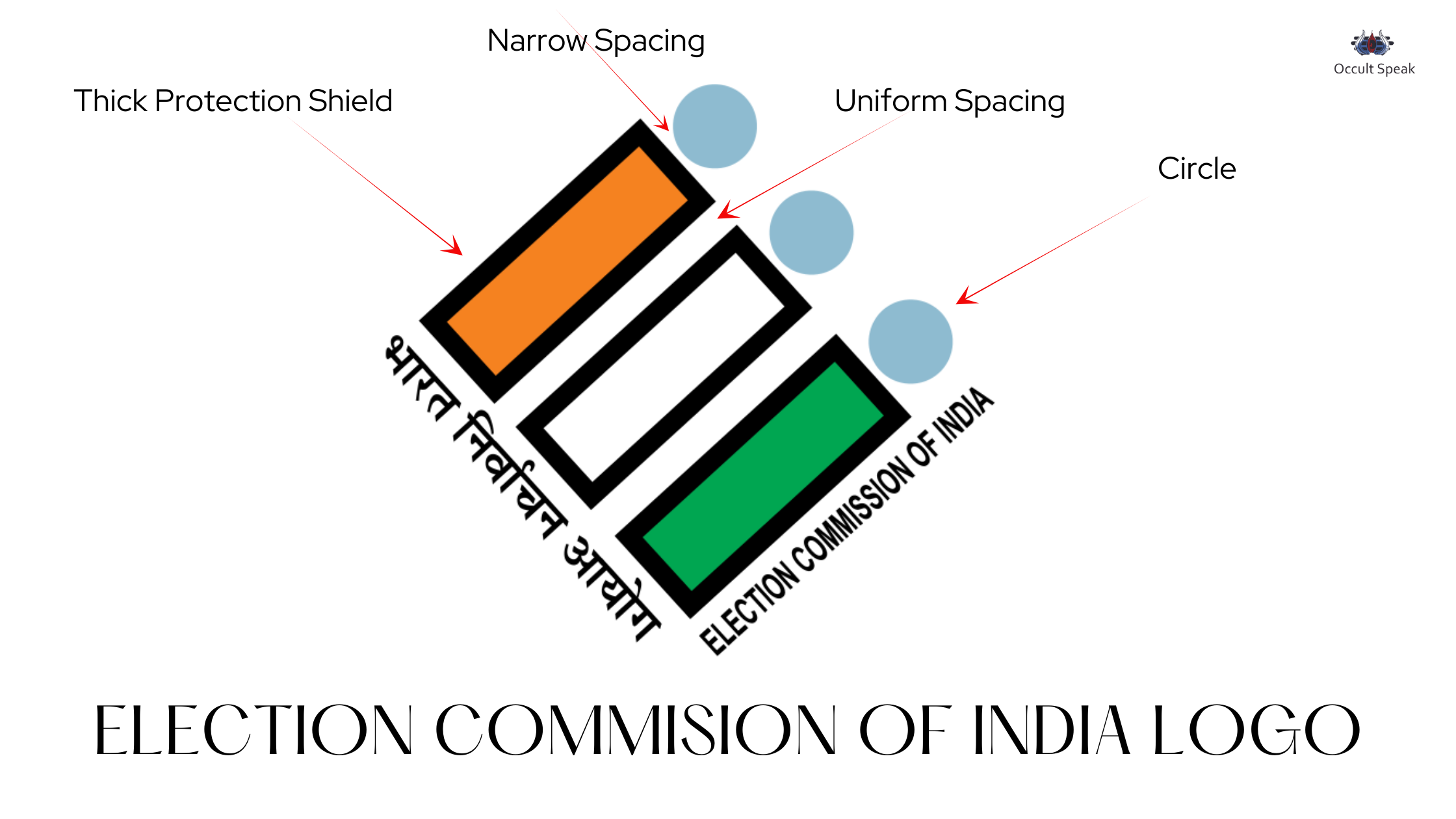
3 Vertical Blocks in Election Commission of India Logo
The logo consists of 2 vertical blocks representing India’s democratic colour with strong thick walls in black colouration showing ECI wants extreme security in their work zone, hence no one can hack or get easy access to the system.
Whether it is launching an electoral machine in elections, strategy creation and launching or any other workflow, all the work will be kept confidential.
The ECI would love the process of a long structural protocol hence, it takes time to process, munch data and create planning parts.
Spacing in between Fonts and Graphic in Election Commission of India Logo :
If you closely look at the Font and Graphic spacing, it clearly shows a good uniform spacing between the structure, this spacing shows timely management by the staff and the top and middle management.
Therefore whatever the policy is formulated it is implemented by the ECI at all levels ( top to bottom ) with the same communication lines with time accuracy.
Delay in the workflow isn’t allowed in the ECI any more.
Perfect Symmetry in the Shape of the Election Commission India Logo:
If you look deeply at the aerial view you can connect all four dots, the 4 sides of the logo making it the perfect Square Shape which is Symmetrical. Such organizations work with strong Ethos and do not believe in the quantity of work rather they deliver the quality in the stipulated period.
The Degree of Titillation in Election Commission of India Logo:
The Logo of ECI is excellent as per the Design, Shape, Structure and even colour combinations but I look at the Tilt Structure depicts unstable formation rather I will say, that the organization will achieve few milestones but early or later ECI will break down or shuttle due to unfavourable circumstances as Logo is not given a based foundation as it is standing on edge with 60 and 45-degree slant..
Logo Principles says such an organization later loses its credibility and may get closed in a later stage or even there would be leakage in the companies ( in the form of money, data, manpower etc ) which gives rise to decline.
![]()
3 Circular Dots in the Election Commission of India Logo
The three Dots in the ECI Logo, show focus on working towards a specific goal for the people. The company ECI will always focus on the fixed agendas whether it is the State Elections, Lok Sabha Elections or policy formulations.
The company does not like interference from the other statutory bodies of the state or central government.
These Dots also show clarity, thorough research and execution of policy.
Spacing ( Circular Structure ) in Election Commission of India Logo
The spacing between the tilted vertical block and circular structure is quite close; the ECI takes its own decision without any hesitation and pressure from the outer or other statutory bodies of the Government or Ruling party.
These spacing also depict data driven from the market or portal that is accurate and realistic and works on practical ground.
Another reading for such closing spacing shows ECI wants to work with strong principles (ethos) and won’t listen to the people making any changes against the nation or the people of India.
The best part is this DOT structure is in a uniform pattern which shows that various company activities are related to each other.
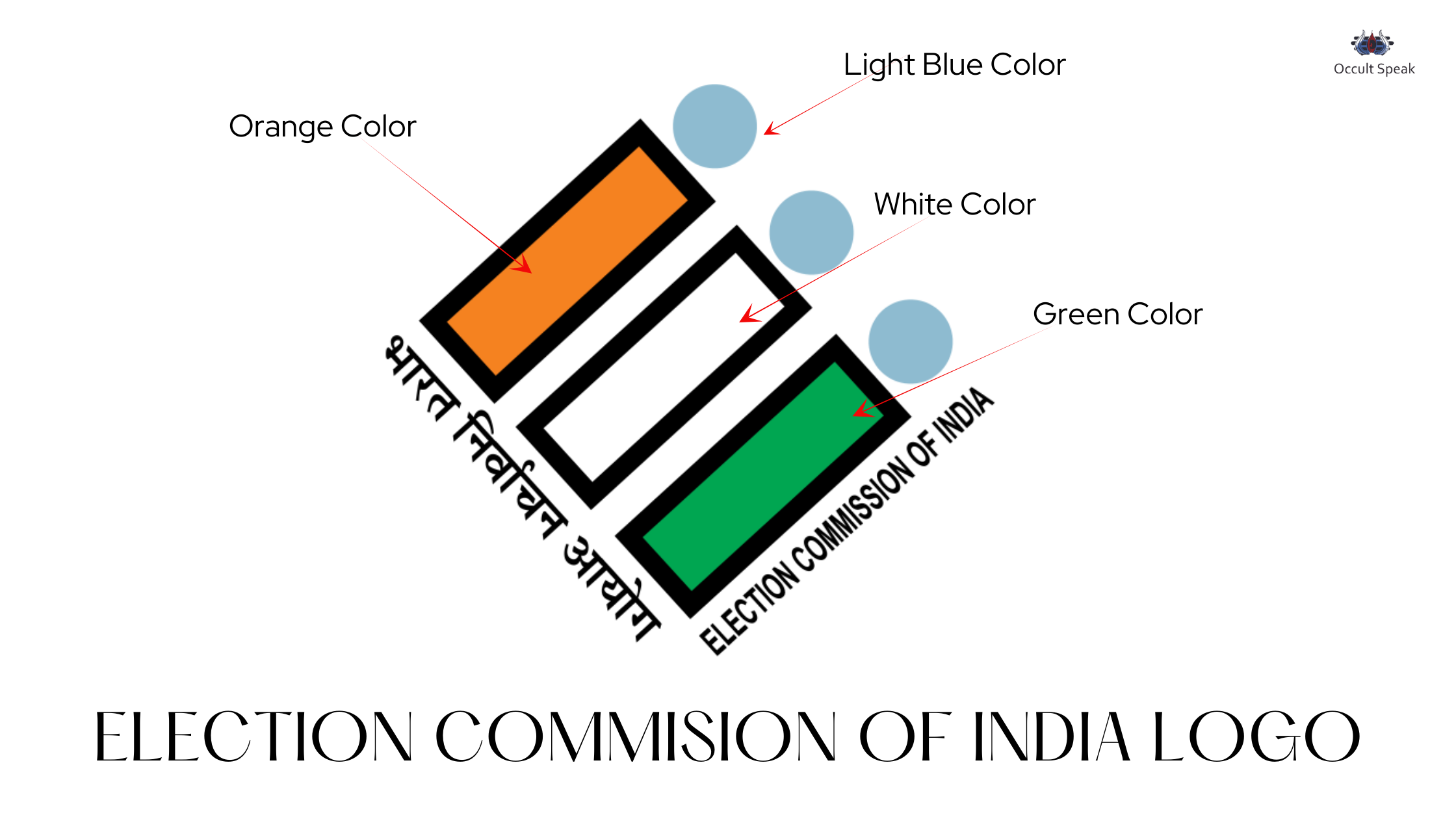
Colour Combination and Analysis in ECI Logo
The tri-colour in the logo depicts pride and patriotic feelings toward the people of India. Apart from the tricolour, if we analyse individual colours then, the interpretation would be much easier for readers.
Orange: The color orange shows extreme aggression and high enthusiasm among the team members and management, and also brings more expectation from the executive team and working committee.
White: The colour white shows strong imagination and care for the surroundings and people around them. Again if we take white as a background for the ECI logo then this shows there is a strong thought process that the company is doing all necessary work, required for the nation.
Green: The colour shows that the company is trying to prove its worthiness. This green colour also shows strong will and determination and people or management always stick to its ideas and principles.
Grey Colour in Circular Structure: The colour shade grey shows little but dullness indicating times when the work may slow down and possibly, the people working here have a serious mindset because this shade makes a person extremely mature and serious, there won’t be fun, entertainment and happy atmosphere in the ECI.
Blue Color in Font: If we look at both font titles Election Commission India and Hindi as Bharat Nirvachan Aayog, the colour chosen is Sky Blue which shows the colour of trust and reliability, this also gives a clear message of good communication and good cooperation and understanding between the members of ECI.
Conclusion: The ECI logo is more than just a symbol; it represents India’s democratic values and the meticulous care taken to uphold them.
It captures the essence of inclusivity, strength, and technological progression that defines the Election Commission of India.
Let me know your thoughts on my perspective on the Election Commission of India Logo Analysis.
Yours Sincerely,
Nirav Hiingu
Logo Design Analyst.
Leave a Reply