

What is BNI ?
BNI Logo : BNi also known Business Network International was established in 1985. It was founded by Dr. Ivan Misner. BNI is the world’s largest business referral organization.
According to The Hindu, Business Network International (BNI) has a significant presence in Mumbai, boasting over 65 chapters and 3,500 members.
These chapters are distributed across five regions within the city. BNI chapters function as networking hubs, facilitating relationship building and referral generation among members to foster business growth.
Let’s dive into detailed logo design analysis for this amazing networking business model.
The BNI (Business Network International) logo is not just a brand mark — it’s a visual handshake that speaks volumes about trust, collaboration, and growth.
Every design choice is intentional, crafted to embody the professionalism and forward momentum that define the BNI network.
BNI Logo Design Analysis
1. Font in BNI Logo : Strength Meets Clarity
The bold, sans-serif typeface used for “BNI” delivers a perfect blend of authority and approachability.
- Bold & Geometric: Symbolizes stability, confidence, and a no-nonsense approach to business.
- Clean Lines: Ensure instant readability at any size, a must for a global brand.
- Modern Minimalism: Projects innovation while keeping the focus on connection and credibility.
2. Shape & Structure in BNI Logo : Solid Foundations with Subtle Motion
The three letters stand as individual pillars, yet together they form a compact block — representing the unity and interdependence of members.
- Angular Precision: Every cut and edge is deliberate, echoing professionalism and structure.
- The “I” Edge Cut: The top-right dot of the “I” isn’t a circle — it’s sliced at an angle. This sharp design cue injects a sense of forward direction, breaking monotony and symbolizing progress.
BNI Logo Design Analysis
3. Size & Proportions in BNI Logo : Balanced for Impact
The proportions are engineered for scalability and instant recognition.
- Dominance of the Wordmark: “BNI” commands immediate attention.
- Perfect Alignment: Creates a visual rhythm that is easy for the brain to process.
- Negative Space: Gives the logo breathing room, ensuring no element feels cramped or forced.
4. Colour Psychology in BNI Logo : Energy, Passion, and Authority
BNI’s choice of rich crimson red is no accident.
- Red = Action: Inspires energy, passion, and decisive movement — essential for business growth.
- Authority & Influence: A colour that commands attention in networking environments.
- Emotional Engagement: Red subtly encourages interaction, making people more open to connection.
5. Spacing in BNI Logo : Precision That Connects
Letter spacing (kerning) is fine-tuned to perfection.
- B & N: Close enough to show unity, far enough to maintain clarity.
- N & I: Balanced to lead the eye naturally from one letter to the next.
Tracking: Even distribution reinforces the feeling of professionalism and order.
BNI Logo Design Analysis
6. Graphological Reading in BNI Logo
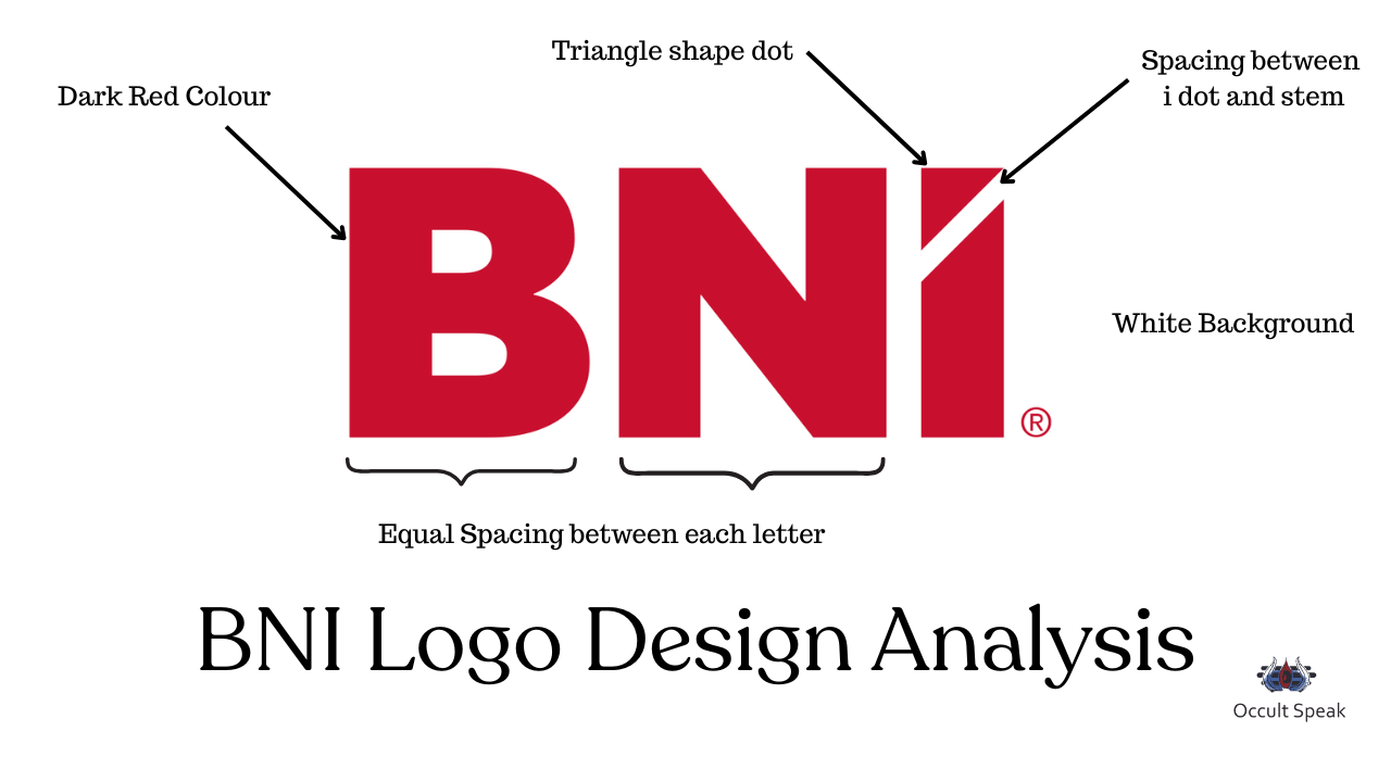
- Red Colour (Action & Growth):
The red shade in the BNI logo represents action, energy, passion, and decisive movement — qualities essential for business expansion and leadership. - White Background (Luxury & Aggression):
The red-white combination indicates a strong, aggressive workspace culture. It reflects a luxurious lifestyle and the company’s commitment to both customers and vendors. However, such intensity may sometimes result in arguments, conflicts, or even legal cases. - Triangle-shaped ‘i’ Dot (Celebration & Recognition):
The sharp triangular dot above the ‘i’ symbolizes high enthusiasm, celebration of success, and the ability to make achievements memorable. - Spacing between ‘i’ Dot & Stem (Systematic Structure):
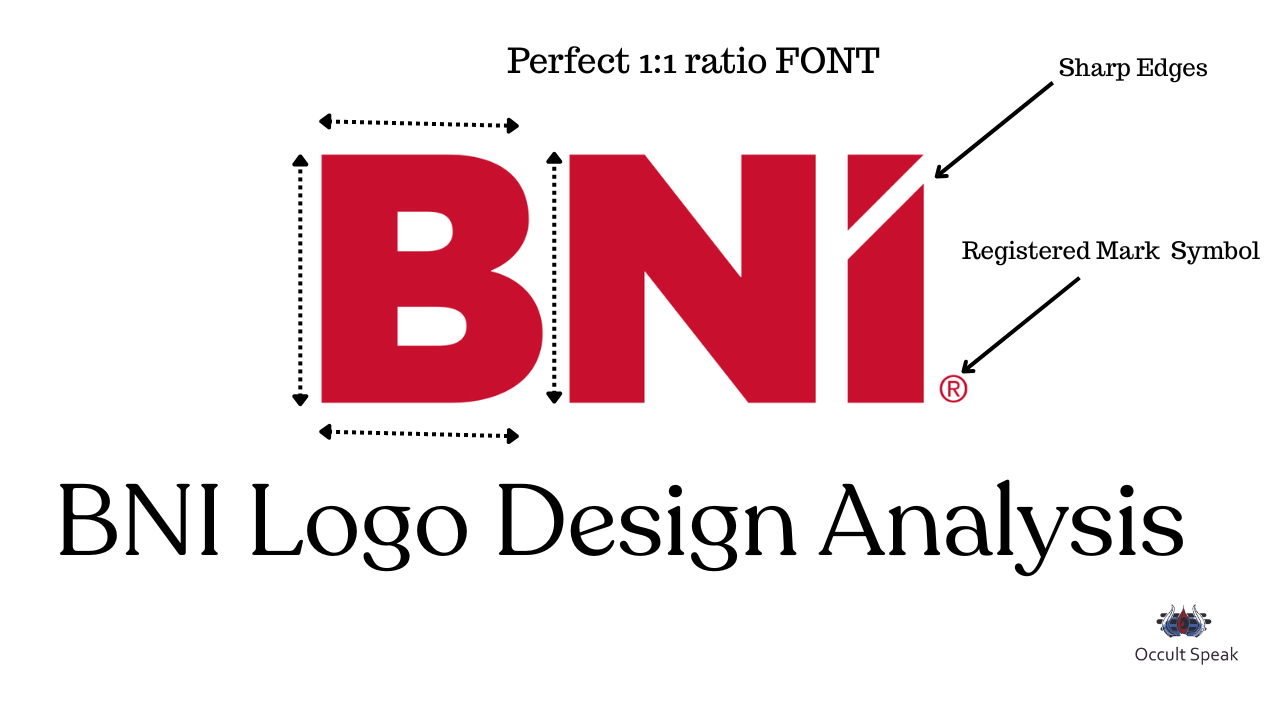
The uniform spacing denotes a systematic approach to planning, coordination, and execution. - Perfect Spacing & 1:1 Ratio in Alphabets (Time Management):
The equal spacing between letters highlights excellent time management skills and disciplined execution. - Registered Trademark Symbol (Strategic Vision):
The ® symbol reflects the organization’s future-focused strategies and strong market positioning. - Sharp Edges in Font (Practicality & Grounding):
The sharpness across the letters shows a practical, logical approach, combined with humility and grounded values.
Final Impression: The BNI logo is a masterclass in strategic branding — bold typography for trust, angular cuts for innovation, commanding proportions for visibility, a high-energy red for engagement, and flawless spacing for unity. Even the angled dot on the “I” speaks of forward-thinking dynamism.
It doesn’t just identify an organization — it tells the story of a global network where business meets growth.
Love & Light,
Nirav Hiingu
Logo Design Analyst
Leave a Reply