State Bank of India Logo ( SBI Logo ) : In my last post on Ayurveda Sahi Hai Logo Analysis, I have discussed the Herbal Startup growth and stability factors based only on Logo Design.
Today we will discuss the SBI Logo , SBI Bank that is better known as State Bank of India that is an Indian multinational, public sector Bank governed by Government of India having headquarters in Mumbai, India.
SBI Logo Meaning?
State Bank of India was founded in 1806 with the brand name as Bank of Calcutta which further merged into another bank named as Imperial Bank of India in 1921 – ( refer to Logo ) , to form as State Bank of India.
State Bank of India has recently changed its brand logo last year. The previous logo was designed by the famous artist Shekhar Kamath in 1971 from NID, the National Institute of Design at Ahmedabad, Gujarat-INDIA.
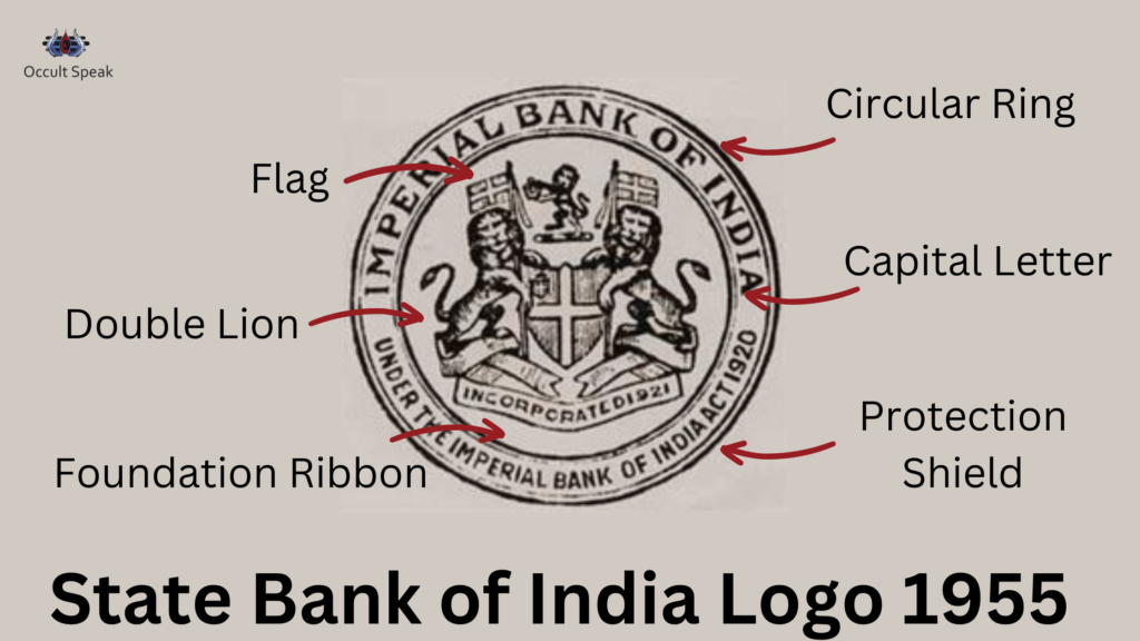
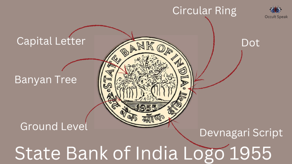
SBI Logo in 1955
The first logo of SBI came into being in 1955 at the time of its establishment.
Today we will discuss the SBI Logo Analysis both old and new logos in-depth.
Well, I have already published an article on general logo analysis of Nirav Modi and SBI logo. (refer to Logo Designs for Businesses).
Let us discuss and dive into the Business aspect and detailed analysis for State Bank of India Logo.
State Bank of India Logo in 1971 (refer the logo)
Initially, the design of the Logo had a White colour that depicts the bank and inside space resembles the customer of the bank. ( Refer to White Black Colour Logo )
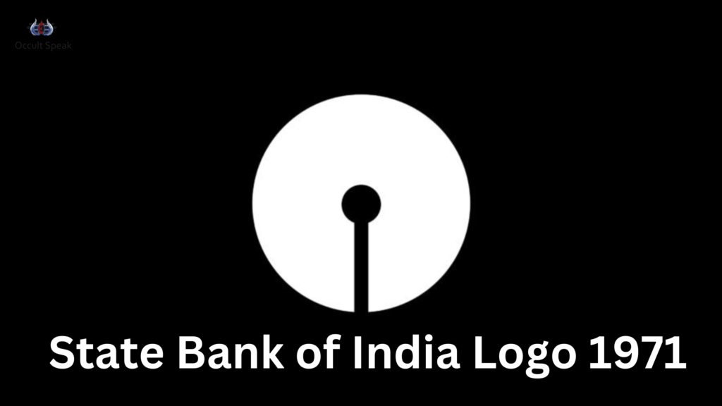
This logo type was introduced in 1971 by Shekhar Kamat during the opening ceremony of the Bombay Office in Maharashtra, India. Later, in the logo, the whole space was filled with the white colour taking place inside the keyhole and the Sky Blue with an external circular ring
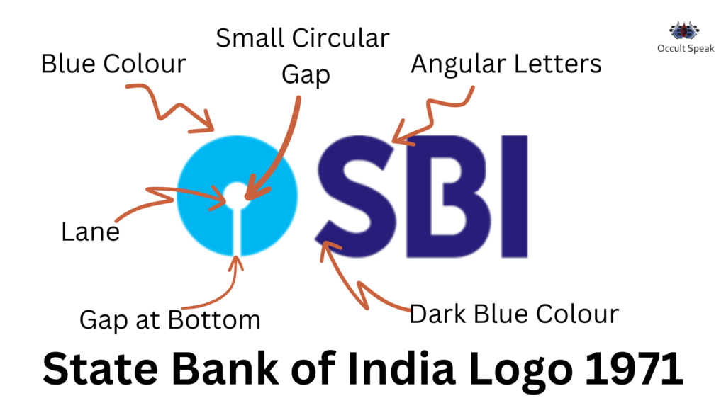
State Bank of India Logo – Final Logo from 1971 – 2017-18 ( refer the logo )
The new design of the SBI logo was declared on 1st October 1971, on the day of the inauguration of the SBI Central office building at Backbay Reclamation, Bombay.
Shape – In The new SBI Logo, Circular formation shows the energy flow moving from top to bottom in a circular motion. Hence the financial flow is moving in the correct direction.
Element – Water element is also seen in this circular shaped logo. This water element being flexible by nature gives them the shape and mould according to the market trend and internal environment.
The Key Lock Structure – The internal shape of the key-lock depicts the security feature of the state bank of India logo, making this multistate conglomerate vulnerable to sensitive issues like data and financial crisis.
Although technically the gap looks like a keyhole, this keyhole makes the logo extremely sensible to the external environment and stakeholders of the company.
A few Designers also depict that this white gap shows the customer-centric company.
Name Font – Instead of using the complete name as State Bank of India, the designer has used the abbreviation ‘SBI’ with white and blue colour.
Font – The modern font of San Serif is used in the logo which is looking simple and sober. Later the font was modified into sharp angular block letters making it as Non-Serif.
Colour – The Major Colour used in SBI Logo is Sky Blue Colour which resembles the sky which depicts the expansion of energy. Hence the Banker wants to reach out to every corner of India.
Thereby its colour perfectly suits the logo giving a huge chance to penetrate the Indian market and capture the mind of the customers.
Still, many older people and even the younger generation want to open their account in State bank of India as it creates a sigh of relief as it is the government of India bank which promises security and honesty.
But the two shades of the blue colour of dark and light create havoc in the banking sector giving instability and disturbances in the Indian market thereby.
White – The colour white depicts the calm and cool temperament of the stakeholders and the board of directors which show they take time to implement any plan and the management will do lots of planning and strategies before moving into the market.
The gap in Key Hole – The minute but a gap in keyhole depicts the leakage of the data and resources in SBI Bank. Although the designer while designing this logo in 1971 says that this keyhole gap was used with an intention that it is common to man and keyhole is the sign of a safe and secure system in banking.
But the gap in the bottom of the Logo itself shows the flow of energy from top to bottom and it gives rise to disturbance to multi banking giants.
Caplock Letter in Logo- The Capital Letter in logo shows the willingness to attract the buyer and customer to the bank because the capital letter is used in the Logo Design wherein the Letter Big sharp pushes itself in the market to become the centre of attraction.
Small Gap Story – there is an interesting story about this 1971 Logo designed by Mr Shekhar Kamat. It is said that the small gap itself represents the office bank and the lane (vertical space) depicts the direction towards the bank.
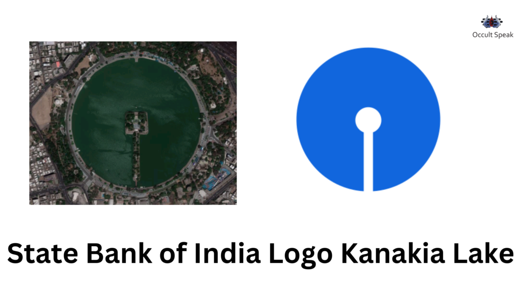
Another story prevailing in India is that Mr Shekhar Kamat had graduated from NID Ahmedabad and this design is inspired from the Kankaria Lake, situated in Ahmedabad, Gujarat resembles the same shape and structure if we look from the aerial view in Google.
Just google the Map online typing Kankaria Lake and you will find the shape of SBI Logo.
State bank of India Logo 2017-18 to till date
Around 2017-2018, SBI Chief Marketing Officer, Mr.Dinesh Menon and the managing committee decided to remove the existing logo and replace it with a brand new logo. Since the logo is related to the people’s core value and sentiment, the managing committee decided to keep the same logo with little alteration in the logo with the rectangular shape and dark colour in the external box.
Box – The rectangular box logo depicts the sharpness and analytical skills of the management and board of directors, also this structure was needed to safeguard the data and resources of their internal and external customers in the terms of data, money, fixed deposit and other assets of the company.
Hence, this small alteration of the box gives a real safety to its stakeholder and customers.
The new logo is the same as the previous one with just an alteration done with colour shade and a rectangular box in the outer layer.
Conclusion – State Bank of India will have a good fortune to grow as it has created its trust, authentication and credibility among the banking sector which gives lots of support from the public as well as from the media publications house.
Let me know how did you find this article on ‘Logo Design of State Bank of India’?
Do you want to Analyse your company logo and does it is favourable with your persona, contact me at contact@niravhiingu.com
Logo Analyst,



Leave a Reply